 CSS垂直居中网页布局实现的5种方法.docx
- 文档编号:20105000
- 上传时间:2023-04-25
- 格式:DOCX
- 页数:27
- 大小:281.09KB
CSS垂直居中网页布局实现的5种方法.docx
《CSS垂直居中网页布局实现的5种方法.docx》由会员分享,可在线阅读,更多相关《CSS垂直居中网页布局实现的5种方法.docx(27页珍藏版)》请在冰豆网上搜索。
CSS垂直居中网页布局实现的5种方法
ThereareafewdifferentwaystoverticallycentreobjectswithCSS,butitcanbedifficulttochoosetherightone.I’llshowyouallthebestwaysI’veseenandalsohowtocreateanicelittlecenteredwebsite.
VerticalcenteringwithCSSisn’taneasythingtodo.Therearemanydifferentwaysthatmaynotworkinsomebrowsers.Let’sreview5differentwaystoverticallycenteringobjects,aswellastheprosandconsofeachmethod.(Youcanseemytestpagebrieflyexplainingallofthem.)
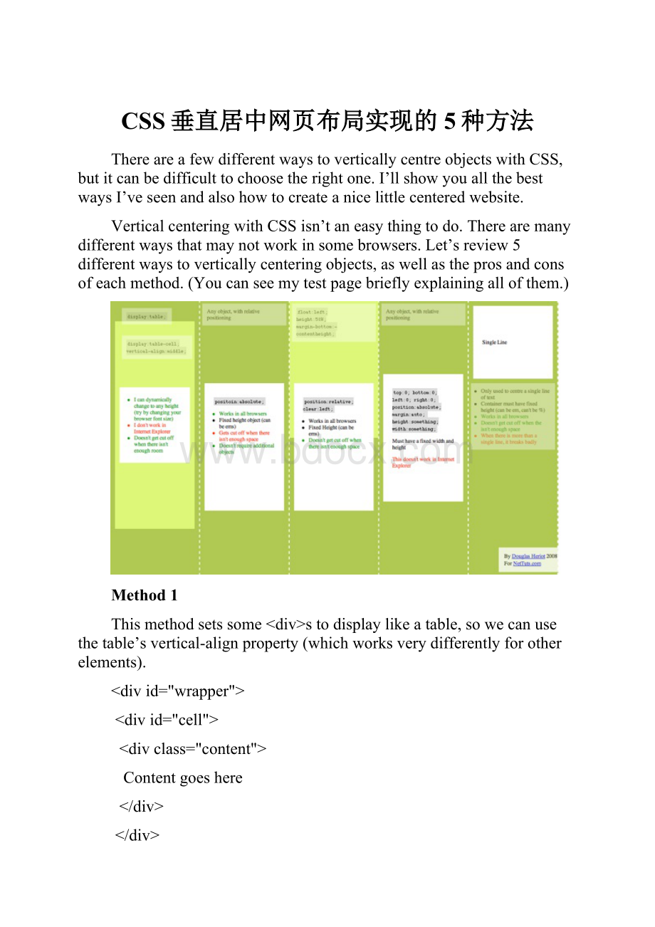
Method1
Thismethodsetssome
Contentgoeshere
#wrapper{display:
table;}
#cell{display:
table-cell;vertical-align:
middle;}
TheGoods
∙Thecontentcandynamicallychangeheight(doesn’thavetobedefinedinCSS)
∙Contentdoesn’tgetcutoffwhenthereisn’tenoughroominthewrapper
TheBads
∙Doesn’tworkinInternetExplorer(noteventheIE8beta)
∙Lotsofnestedtags(notreallythatbad,thisisasubjectivetopic)
Method2
Thismethodwilluseanabsolutelypositioneddiv,whichhasthetopsetto50%andthetopmarginsettonegativehalftheheightofthecontent.Thismeanstheobjectmusthaveafixedheight,thatisdefinedbyCSS.
Becauseithasafixedheight,youmaywanttosetoverflow:
auto;tothecontentdiv,soifthereistoomuchcontenttofitin,ascrollbarwillappear,insteadofthecontentcontinuingonoutsidethediv!
<divid="content">
ContentHere
</div>
#content{position:
absolute;top:
50%;height:
240px;margin-top:
-120px;/*negativehalfoftheheight*/}
TheGoods
∙Worksinallbrowsers
∙Doesn’trequirenestedtags
TheBads
∙Whenthereisn’tenoughspace,thecontentdisappears(suchaswhenthedivisinsidethebodyandtheusershrinksthebrowserwindow,ascrollbarwillnotappear)
Method3
Inthismethod,wewillinsertadivabovethecontentelement.Thiswillbesettoheight:
50%;andmargin-bottom:
-contentheight;.Thecontentwillthenclearthefloatandendupinthemiddle.
Contenthere
#floater{float:
left;height:
50%;margin-bottom:
-120px;}
#content{clear:
both;height:
240px;position:
relative;}
TheGoods
∙Worksinallbrowsers
∙Whenthereisn’tenoughspace(ie.thewindowshrinks)ourcontentwillnotbecutoff,andascrollbarwillappear.
TheBads
∙OnlyoneIcanthinkofisthatitrequiresanextraemptyelement(whichisn’tthatbad,anothersubjectivetopic)
Method4
Thismethodusesaposition:
absolute;divwithafixedwidthandheight.Thedivisthentoldtostretchtotop:
0;bottom:
0;.Itcan’tbecauseofthefixedheight,somargin:
auto;willmakeitsitinthemiddle.Thisissimilartousingtheverycommonmargin:
0auto;tohorizontallycentreblockelements.
Contenthere